

Need Help?
Navigating the Public Dashboard Interface
This guide covers AlphaX public accessible dashboards include changing dashboard time ranges, maximising charts, downloading data.
UI Elements
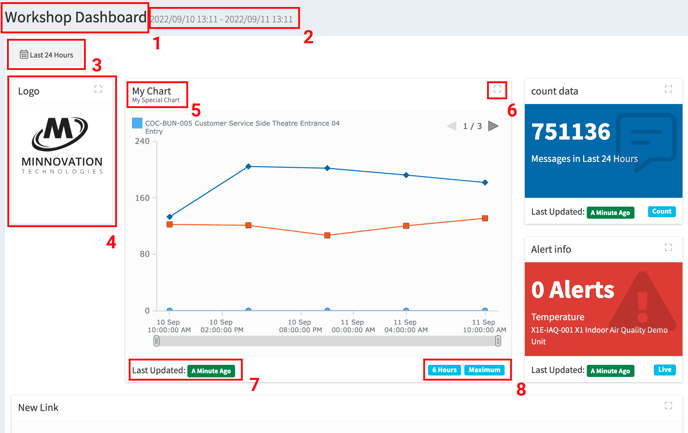
The user interface of the dashboard feature remains the same regardless of its content. there are 8 primary components that users can either interact with, or that will give users quick access to information that is important.
Note: The dashboard may be embedded within another webpage so that there may be additional elements around the images shown in this guide. Please refer to original page owner for information about those elements.
Elements have been marked up on the image below and are summarised in the descriptions.
- Dashboard Title: this is the name given to this dashboard.
- Date Range: This is the current selected date range and the dates of the data that is currently being displayed.
- Date Selector: Button that allows users to select the date range that they would like to view information for.
- Widget: Each seperate information, chart, map and any other elements are displayed in their own container. This is referred to as a widget.
- Widgets data is controlled by the date range specified in the date selector button (3), but may be aggregated differently as displayed in the aggregation information (8)
- Widget Title: A main heading and sub-heading (optional) is supplied for each widget. best practice is to use these fields to describe the data contained within the widget but may vary.
- Maximise Button: This button allows users to maximise the widget to become the full size of the screen available to them.
- Last update: This shows the last time the information in the widget was updated.
- Aggregation details: Aggregation and grouping details for each widget. This describes the way the original data may have been arranged to display in the chart.
Changing Dashboard Ranges
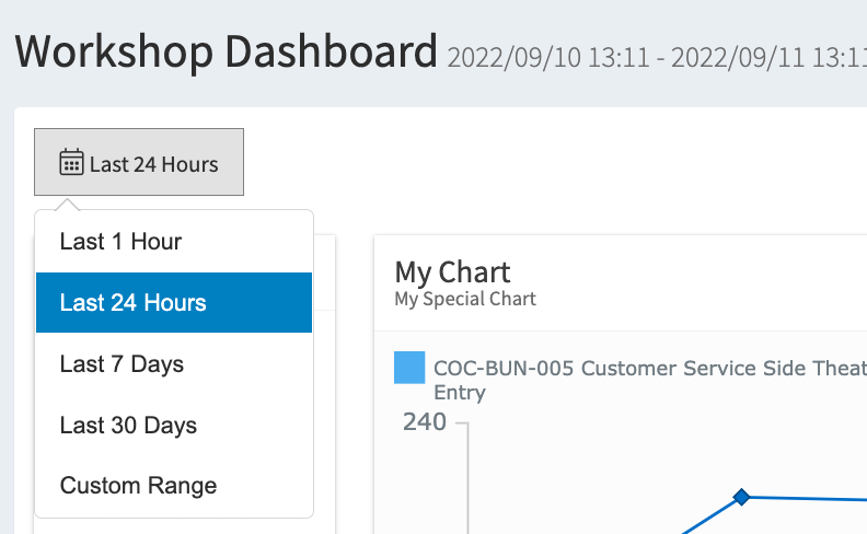
User are able to select time ranges for the data contained within the dashboard by selecting the date selector button (3) and choosing a date range.
Default date ranges are pre-set in the selector for 1 hour to 30 days.
Users may also select custom range if that option is available to them. Custom range requires the user to select a start range and an end range by clicking on the pop-up calendar twice. Use the time boxes to also select start time and end time.
Note: If the Custom Range selector is not available, please refer to your system admin or platform integrator.
Maximising Charts
Clicking on the button in any widget will instantly maximise that widget to be full screen. This is a very handy feature on the chart and datatable widgets.
Downloading Data
On any chart widget users are able to right click on the chart and are presented with options to download their data.
Users can choose to save their chart, download their data or share.
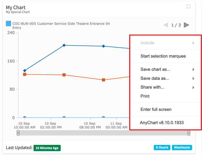
Save Chart.
Users can select the Save chart as… option to download an image of the chart in the following formats.
- JPG
- PNG
- SVG
Save Data.
Users can select the Save data as… option to download the data from the chart in the following formats. Note. The downloaded data will be formatted to match the aggregation details (8) of the chart.
- CSV
- XLSX
Share With
Users can choose to Share with… option to share a copy of their chart image with their social media networks.